Making Financial Literacy Engaging
Team
Long Game CEO, CTO, CMO, Engineering, Support, and Game Designer
Outsourced content writer and illustrator for icons
My Role
Lead Product Designer & Design Director
UI/UX, Testing, Prototyping, Marketing materials, art direction
Project Summary
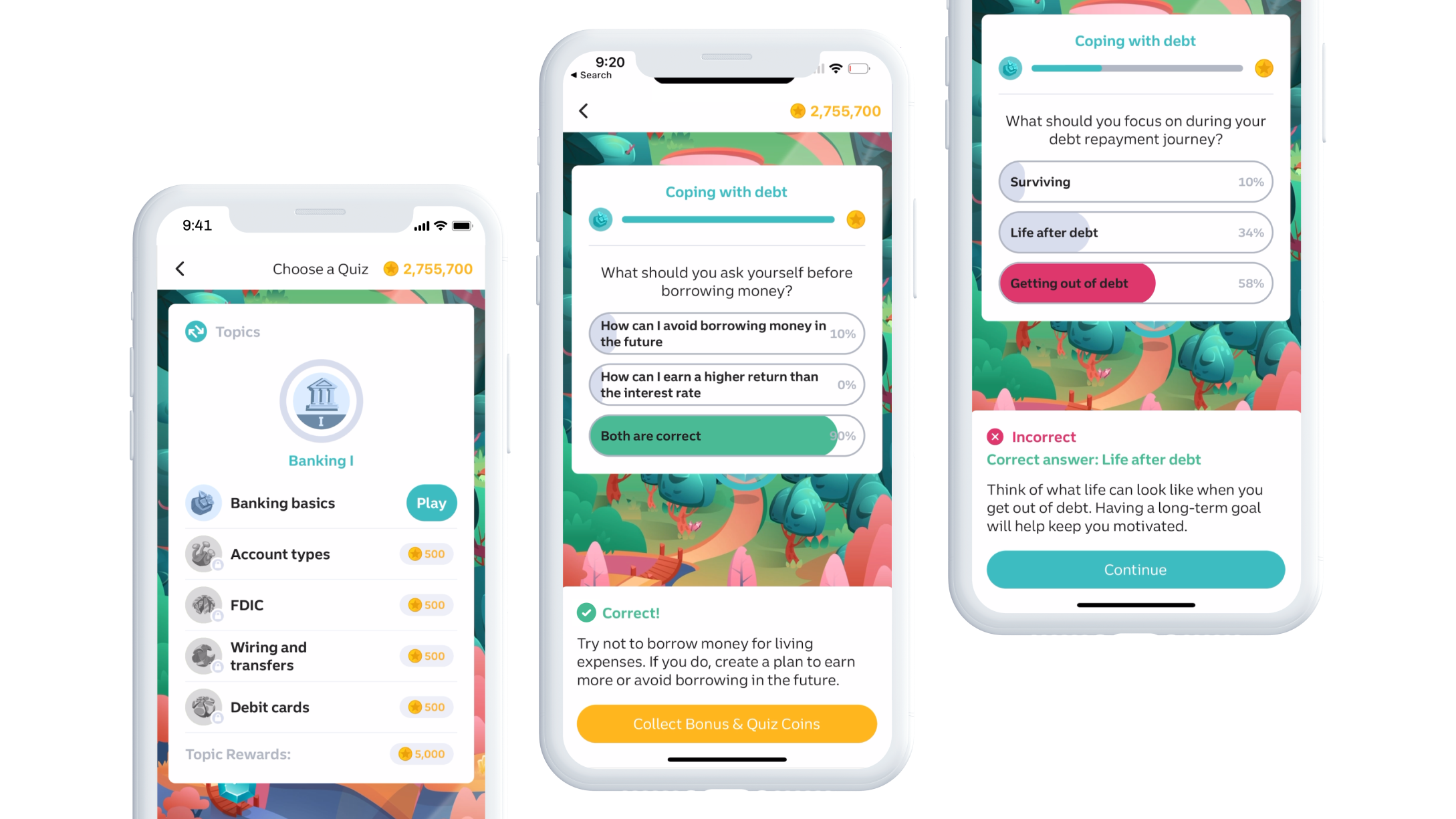
Long Game Rewards is a mobile personal finances game built upon behavioral economics mechanisms, like prize-linked savings, and deep insights from mobile gaming. The core mechanic is to save money, earn Coins for maintaining a balance, and play games of chance for cash prizes. How can we reward users for more than positively engaging with their finances in between deposits?
The Opportunity
Improve our user’s financial literacy.
The Solution
A trivia game that quizzes and teaches users’ while rewarding them for engagement.
The Results
A trivia game that quizzes and teaches users’ while rewarding them for engagement.
Problem Statement
One-third of Americans are financially illiterate, and many financial institutions lack methods to help.
Long Game has the opportunity to help bank users learn more about finances in a fun and engaging way while getting rewarded. Studies show the more financially literate you are, the more successful you are managing your short term and long term money.
Objectives and Goals
01
Educate without condescension
02
Maintain a positive experience when engaging with finances
03
Create a non-monetary mechanic to reward users for engagement
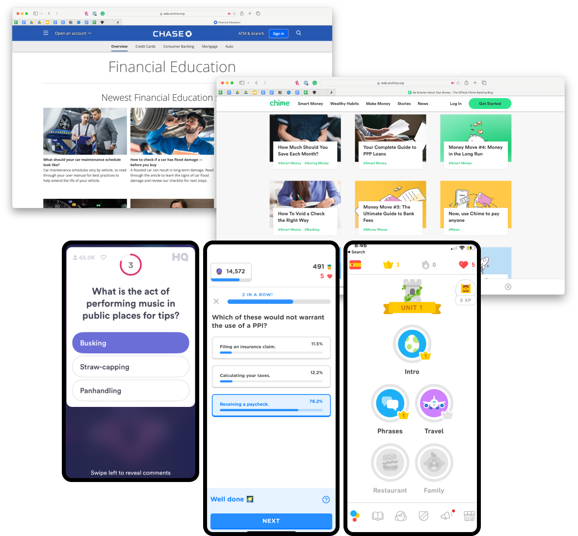
Competitive Analysis (2021)
- Education Tools that use gamification (Duolingo, Memrise)
- Trivia Apps (Zogo, HQ, Quizup)
- Articles of Education (financial institution blogs)
Early Testing and Validation
I surveyed our users to confirm interested in a trivia game, and conducted an initial remote user test on Trymata.
Information Architecture
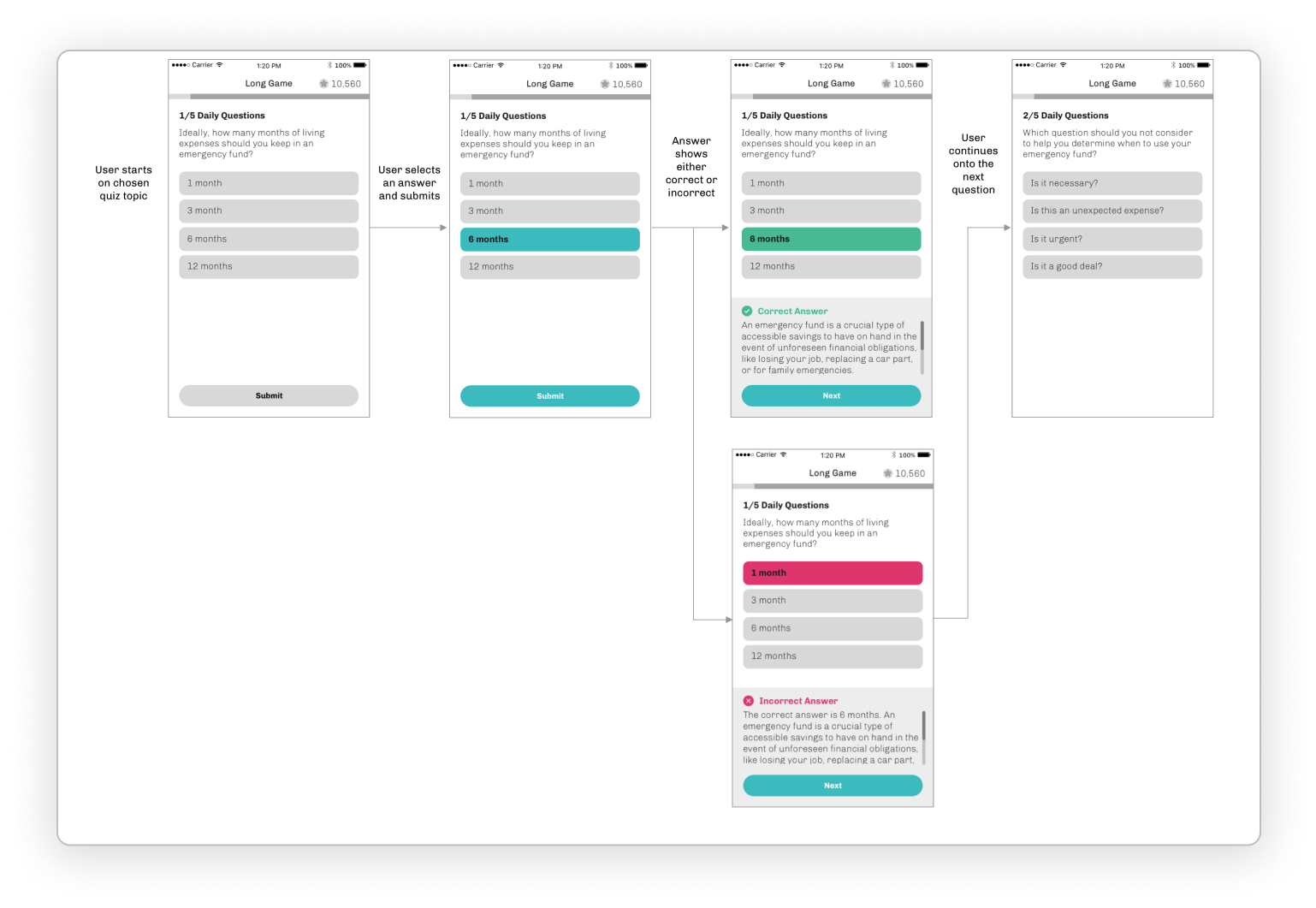
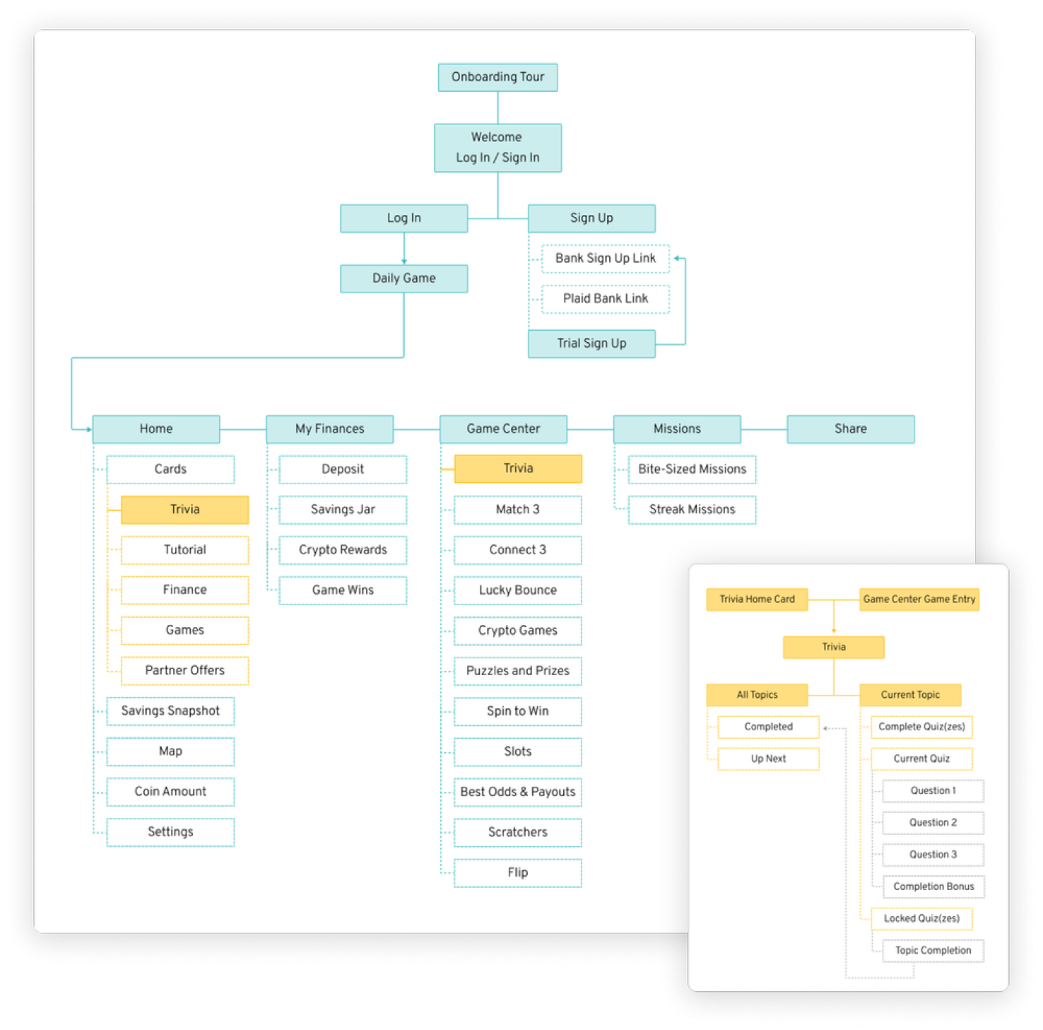
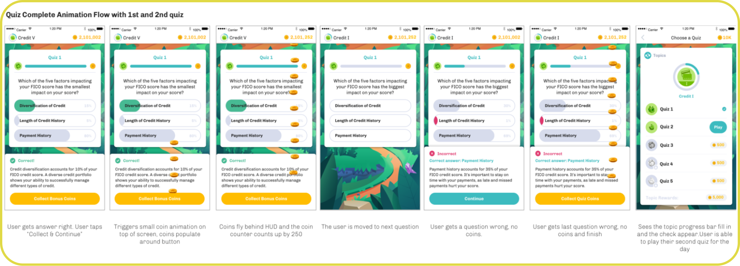
Exploration of structure for trivia, including the flow for navigating into trivia, into category selection, quiz completion, and category completion.
Discussions on the educational content as well as how much content to include and when to reward users.
Usability Test
Test an MVP for usability and comprehension of the category selection, quiz selection, and quiz completion. Prototyped in Marvel and unmoderated remote test on Trymata.

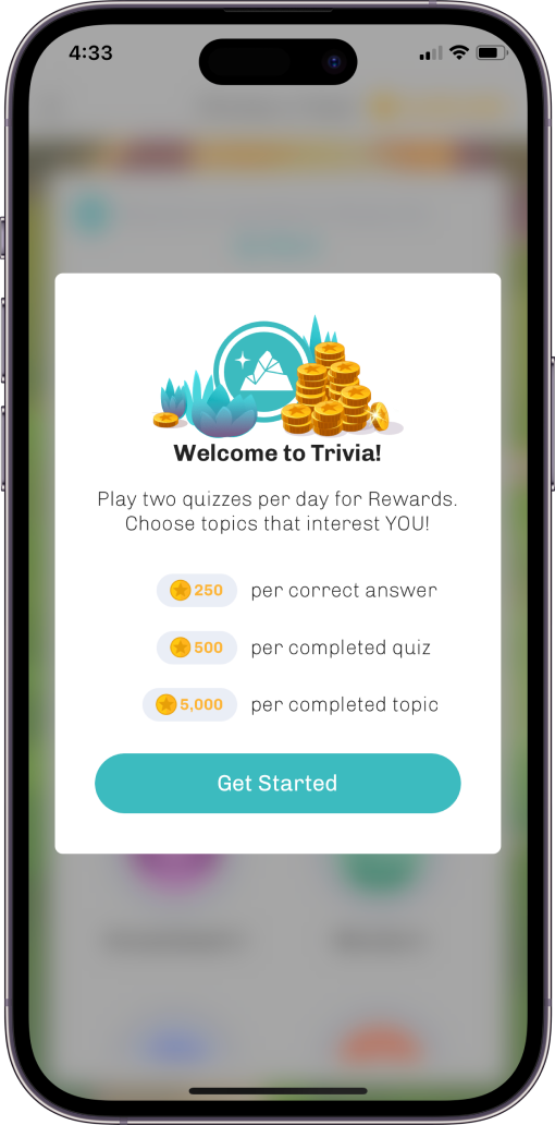
Early tests revealed a problem:
Users didn’t know what to expect without added context. We decided to add an introduction tutorial to give them more information about how the feature worked, and what they could expect.
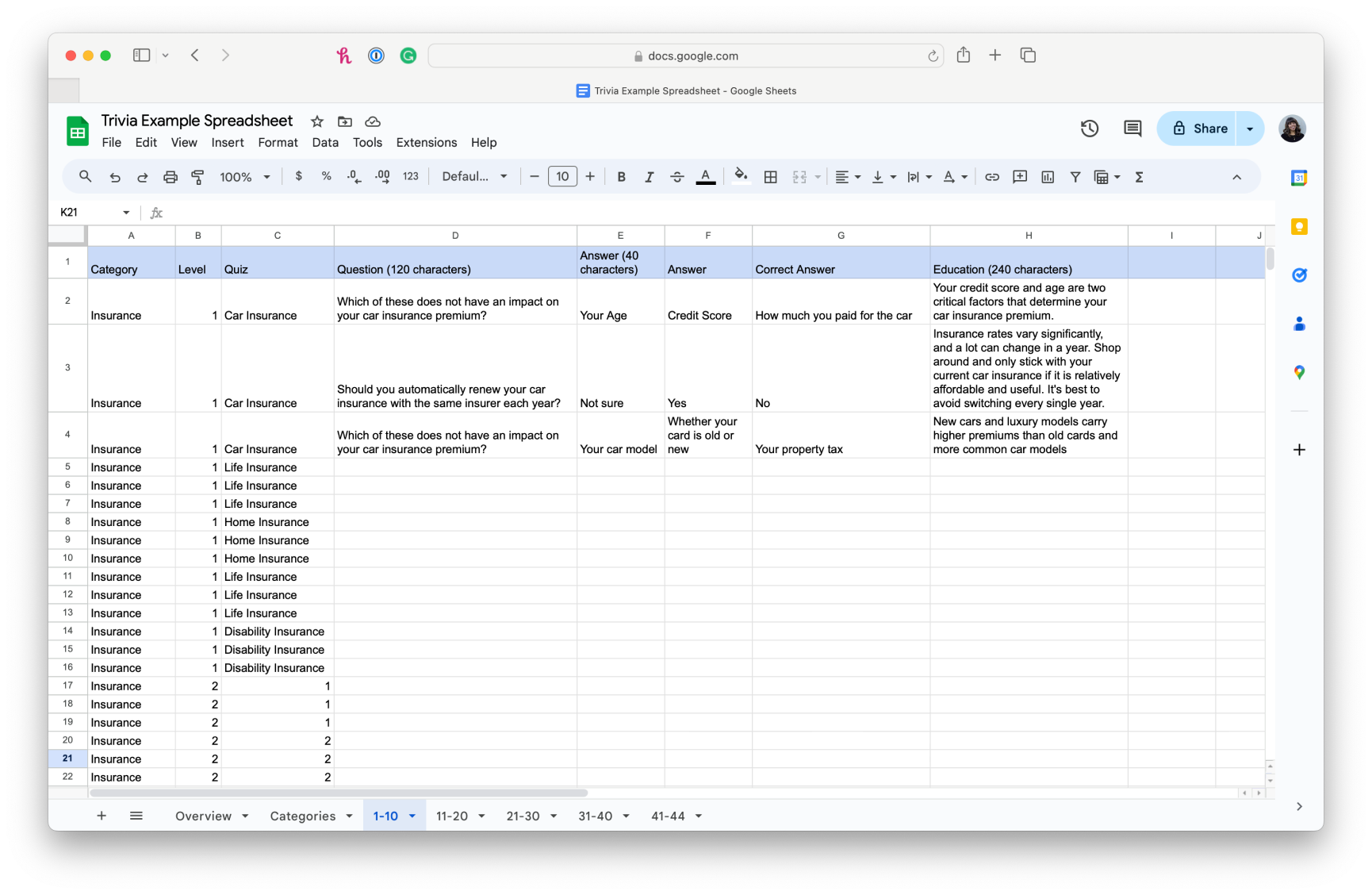
Designing the feature in Collaboration with engineering and content
I co-wrote the spec with our game designer and got early and often feedback from engineering leads. Together, we strategized an MVP and planned out iterations.
Our team utilized a content spreadsheet to ensure character limits and parameters were met.
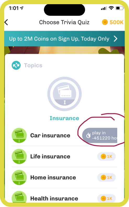
Handoff for implementation and QA Testing
Frequent testing of builds and created bug reports for engineering
Used Asana for our bug reports and tracking
Entire team tested as we neared launch
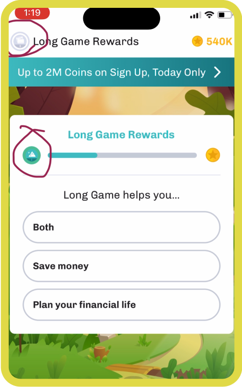
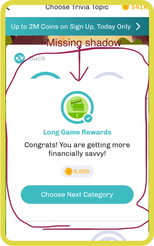
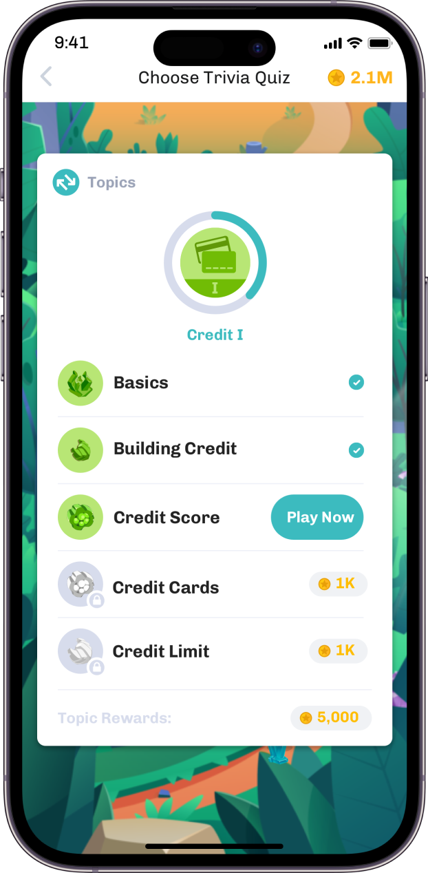
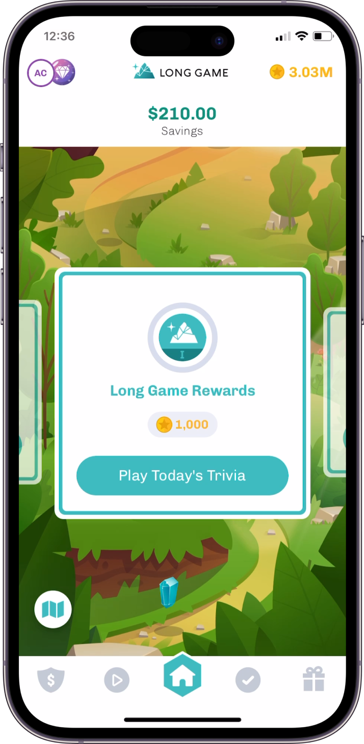
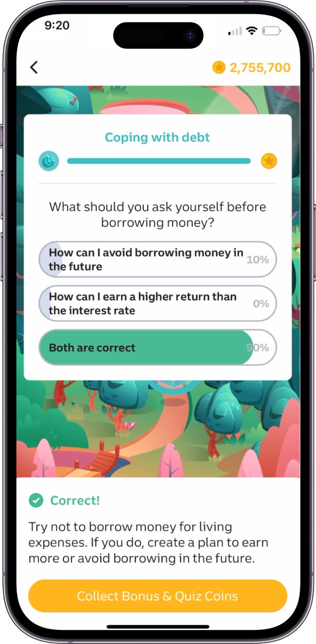
The Results
The success of this feature is due to the habitual nature of it - it’s not a game you can beat in one day. Instead, you have to show up for bite-sized quizzes each day to test your skills and get your Coin rewards.
Metrics
65% of users played trivia with an average 13 min session time 4 days per week
Reception
Long Game users loved trivia. Over 70% engaged daily for the first month.
Takeaways
Improve the quality and quantity of the content by working with a larger financial expert resource.