How I Designed a 0-1 Savings App
Team
Long Game CEO, CTO, CMO, Engineering, Support, and Game Designer
Outsourced creative team
My Role
Sole Product Designer
UI/UX, Testing, Prototyping, Art Direction, Game Design
Project Summary
Long Game Savings began when Lindsay Holden and Ashby Monk noticed that almost 70% of Americans couldn't afford a surprise $500 expense. At the same time, the average American also spent up to $500 on lottery tickets per year. The two wondered if they could redirect this spending into savings. Could they use the same psychological tricks that make gambling so addictive? The solution they developed was a mobile banking app that combined a savings account with a variety of lottery-style games. Users earned a steady stream of in-app tokens (Coins) for saving money, which they could then use to play games of chance for real cash prizes.
Long Game started as a simple app with a few basic games and a savings account. Over its lifetime, it grew to include a rewarded checking account, bite-sized missions, savings goals, a personalized financial life map, and a variety of non-monetary mechanisms to inspire engagement and increase savings. I directed the design of the app throughout these iterations, working closely with the CEO, engineering team, and game designer to craft a vision for Long Game's future and bring it to life.
The Opportunity
Americans have a savings problem and a gambling problem. Can we leverage gambling mechanics to encourage savings growth?
The Solution
A mobile banking app that combines a savings account with a variety of lottery-style games to get users hooked on saving money.
The Results
25% user savings growth with industry-defying low CAC bank conversions and average user engagement of 4.5 days/week.
Long Game begins
The Beginning
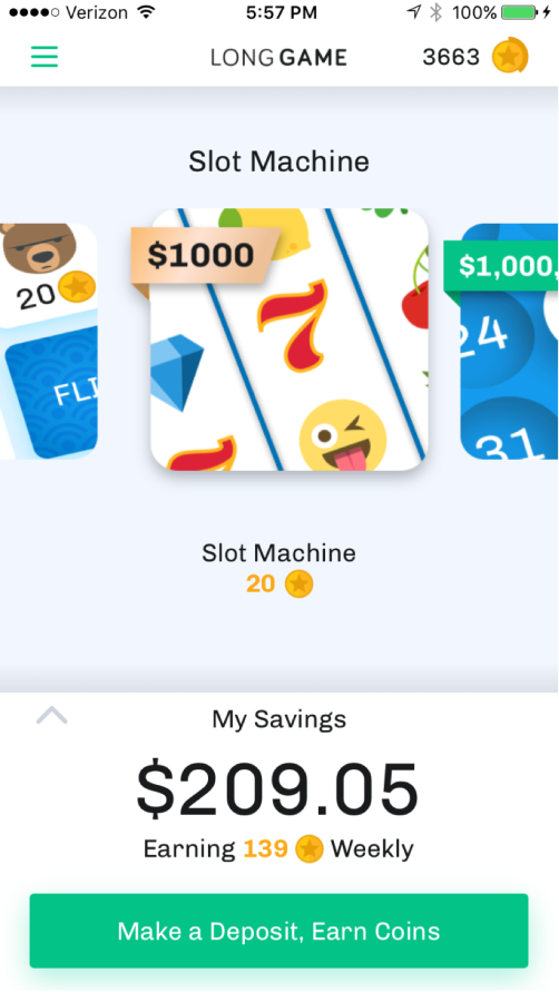
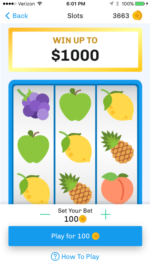
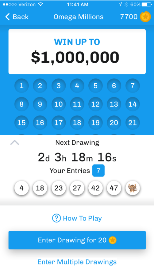
I joined 2 years after Long Game was founded and was the sole designer on the team. The app was simple with minimal lottery-style games and a basic savings account.
The initial design left a lot to be desired. The app lacked a cohesive brand and there weren't many features to keep users engaged, so we got to work on building out a larger feature-set and revamping the design.
Initial state of the app
Business goals
- Increase Weekly Active Users with a Balance (WAUB)
- Target and capture the millennial demographic
- Increase deposit growth to lead towards revenue
Creating a Roadmap
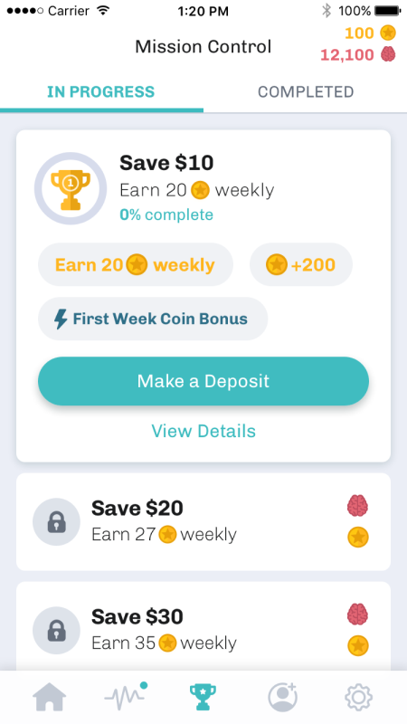
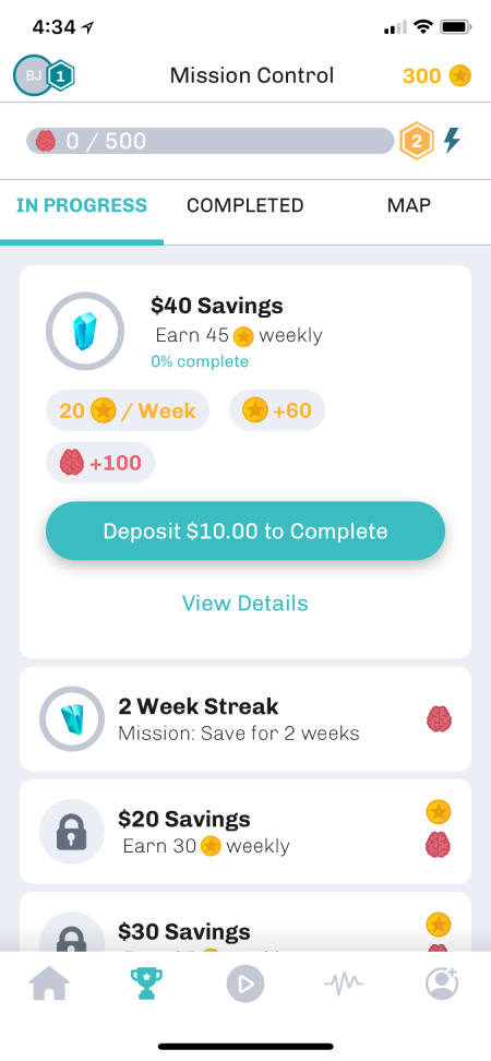
- Bite-sized missions inspired by behavioral science to keep up momentum and reduce overwhelm when saving
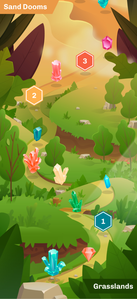
- Your financial life on a personalized map, guiding you to your goals
- Non-monetary mechanisms to inspire engagement like levels, rewards, and boosts
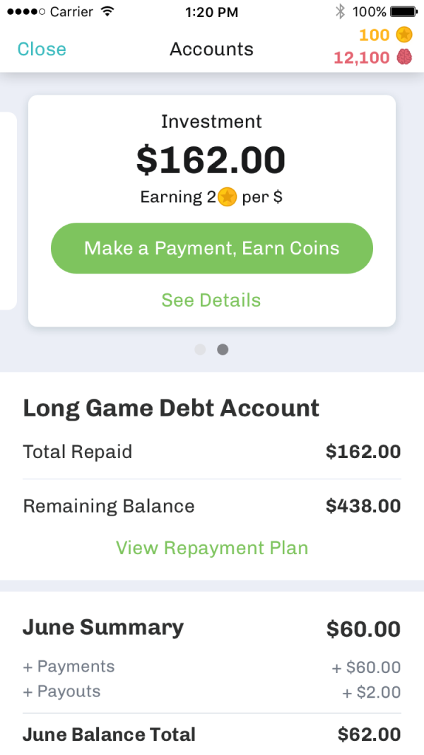
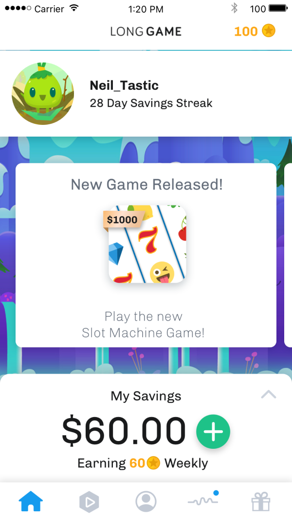
“Vision demo” dream state exploration of UI/UX:
Phase out the Vision
-
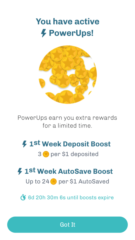
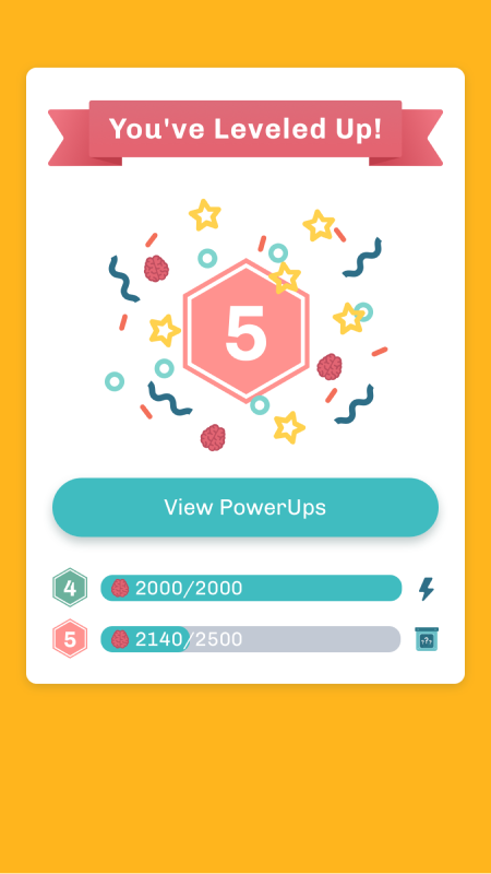
Bundle 1: Levels, Brains (engagement currency, separate from Coins), and bite-sized missions
-
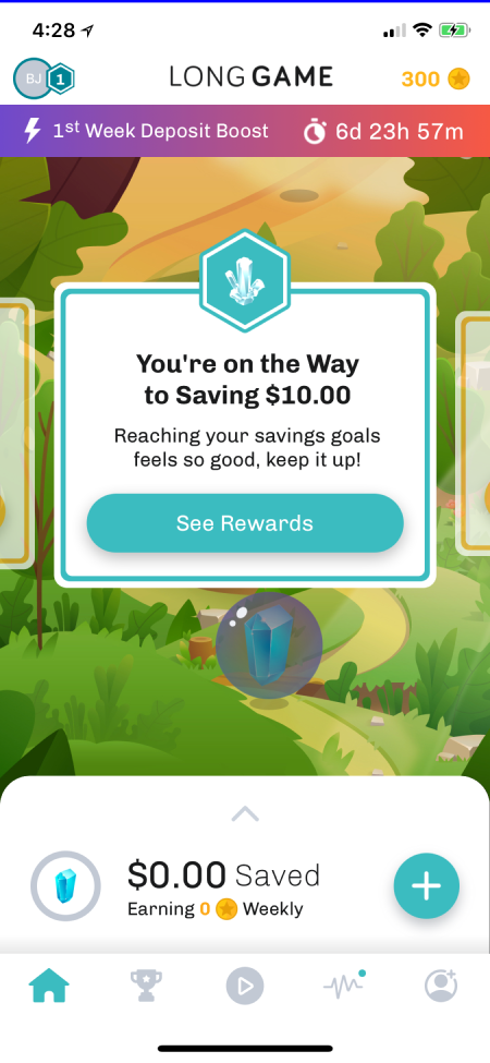
Bundle 2: Cards to communicate with the user, Game Center for a central place for finding mini-games, and savings streak rewards
-
Bundle 3: Journey Map to visually track progress with the goal to have the user’s entire financial life be trackable here one day
Goals
- Build upon Missions success
- Acheive Virality
- Find consistent revenue model
Refining the Brand
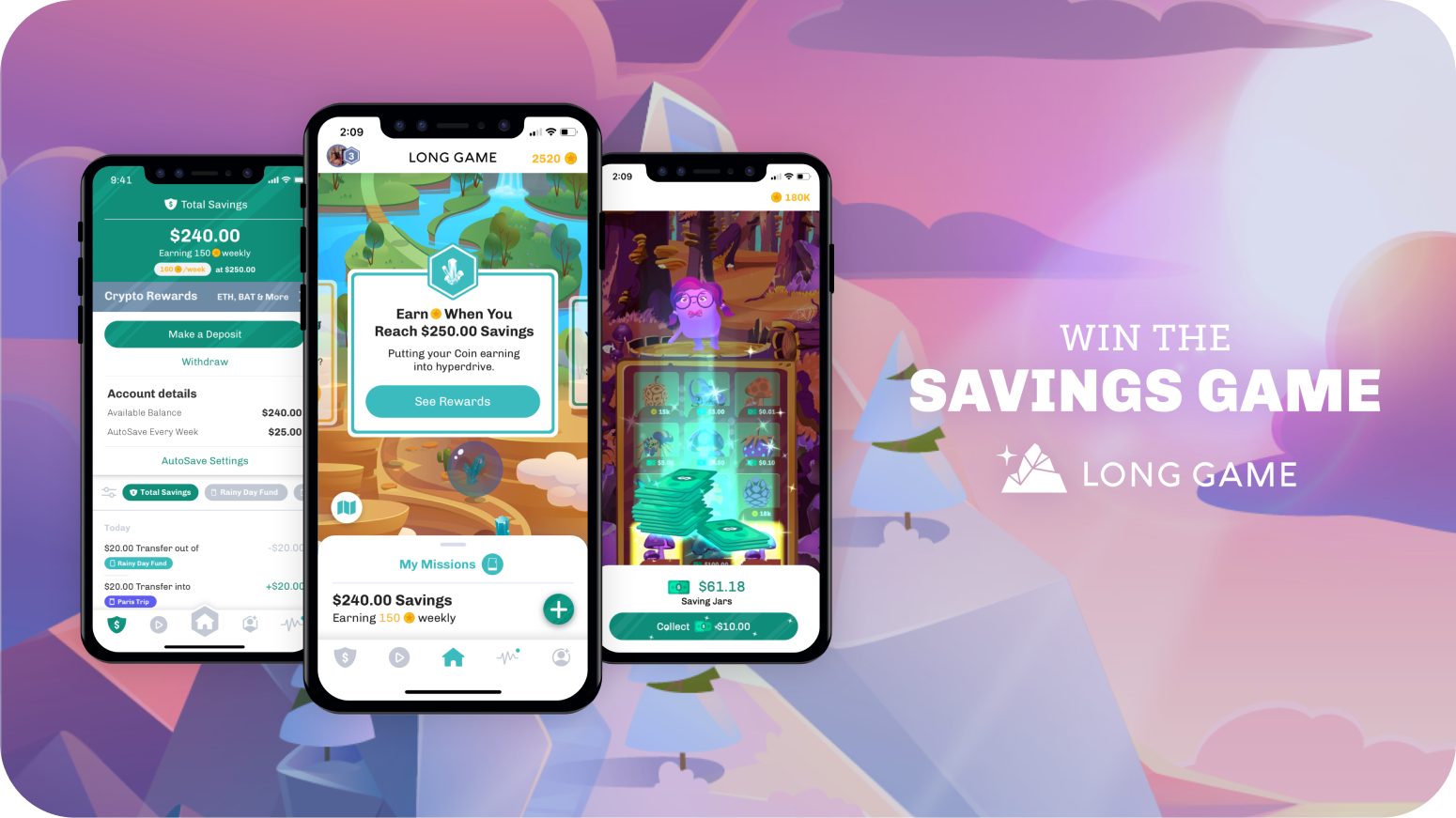
Around this time, we redeveloped our brand identity to a more youthful aesthetic. This differentiated us from traditional banks, with hopes of attracting a younger demographic. This included:
- A new logo, tagline, and art direction
- A simplified yet vibrant palette
- A unified design system with a cohesive visual style
- Themed games that were more tied into the overall style
I managed an external consultancy, Supernova design team, in developing the brand logo and style guide, and then implemented it across the app's design system.
Building upon Missions with Savings Goals
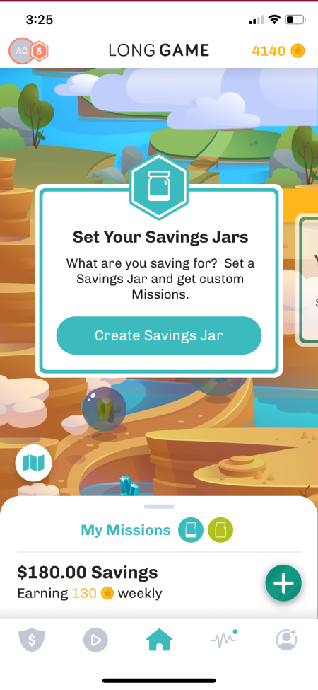
After the success of missions, we decided to go deeper in on a personalized savings experience.
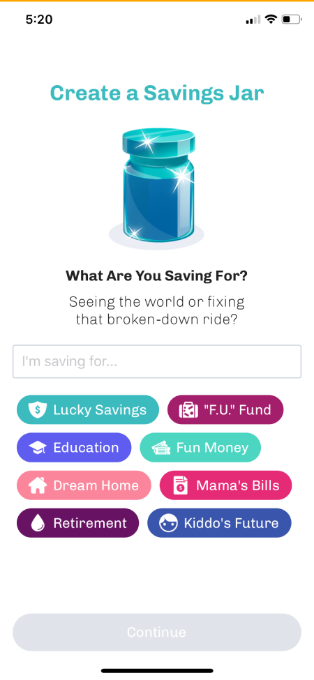
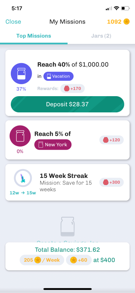
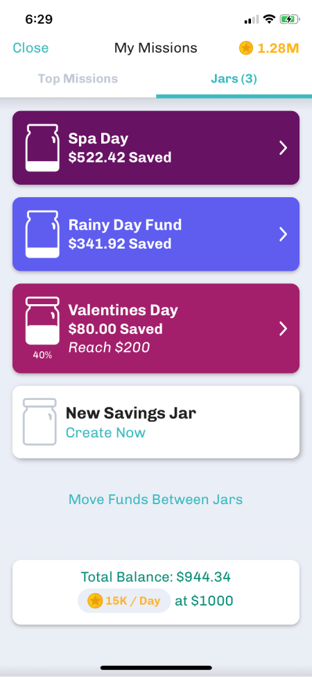
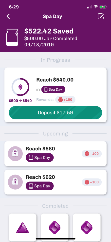
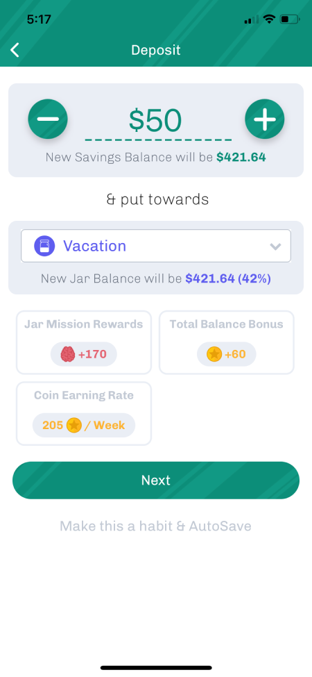
I began by conducting market research, and came up with savings jars to act as an envelope system for users to save for multiple ongoing goals, similar to popular budgeting apps like YNAB.
Savings jars allowed users to plan out future savings goals and track their progress, and were some of the first steps toward enabling users to map out their financial future in the app.
Attempt Virality
Long Game users were in love with the app, but we were having trouble acquiring new users at a sustainable rate. Our core demographics, Millenials and Gen Z, were highly active online, so we focused on features that would spread via word of mouth.
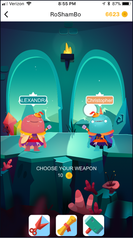
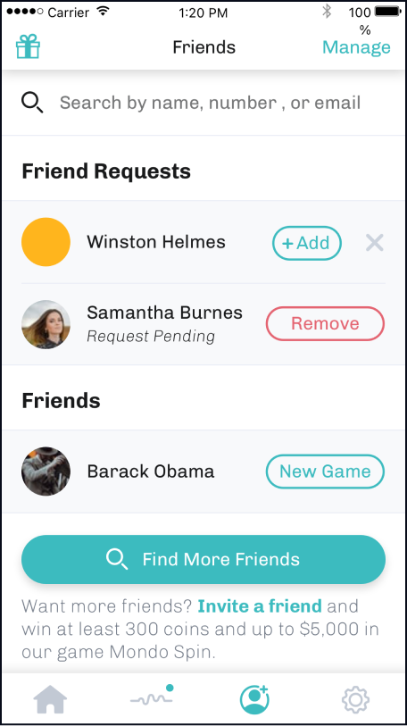
- Exclusive player-vs-player games through connecting with in-app friends
- Personable, customizable avatars to give players a sense of emotional connection
- Referral rewards and bonuses
Crypto
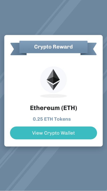
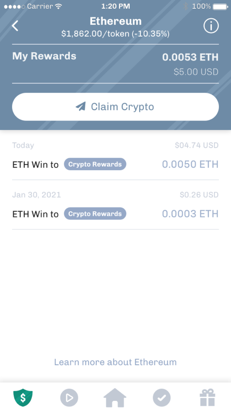
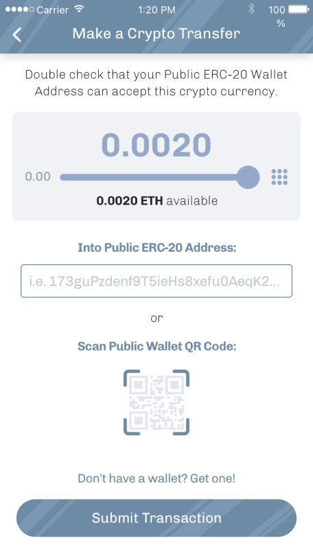
In an effort to make crypto more accessible to our users during the rise of the crypto boom, we offered 3 types of cryptocurrencies. These were winnable in crypto games and were held until a user initiated transfer to an outside wallet.
This feature was very successful early on and helped us reach a new demographic of users, but eventually became a liability as the crypto market became more volatile.
Goals
- Reach new potential with revenue
- Refine the core loop
- Refine the app (simplify, simplify, simplify!)
Becoming a Neo-Bank
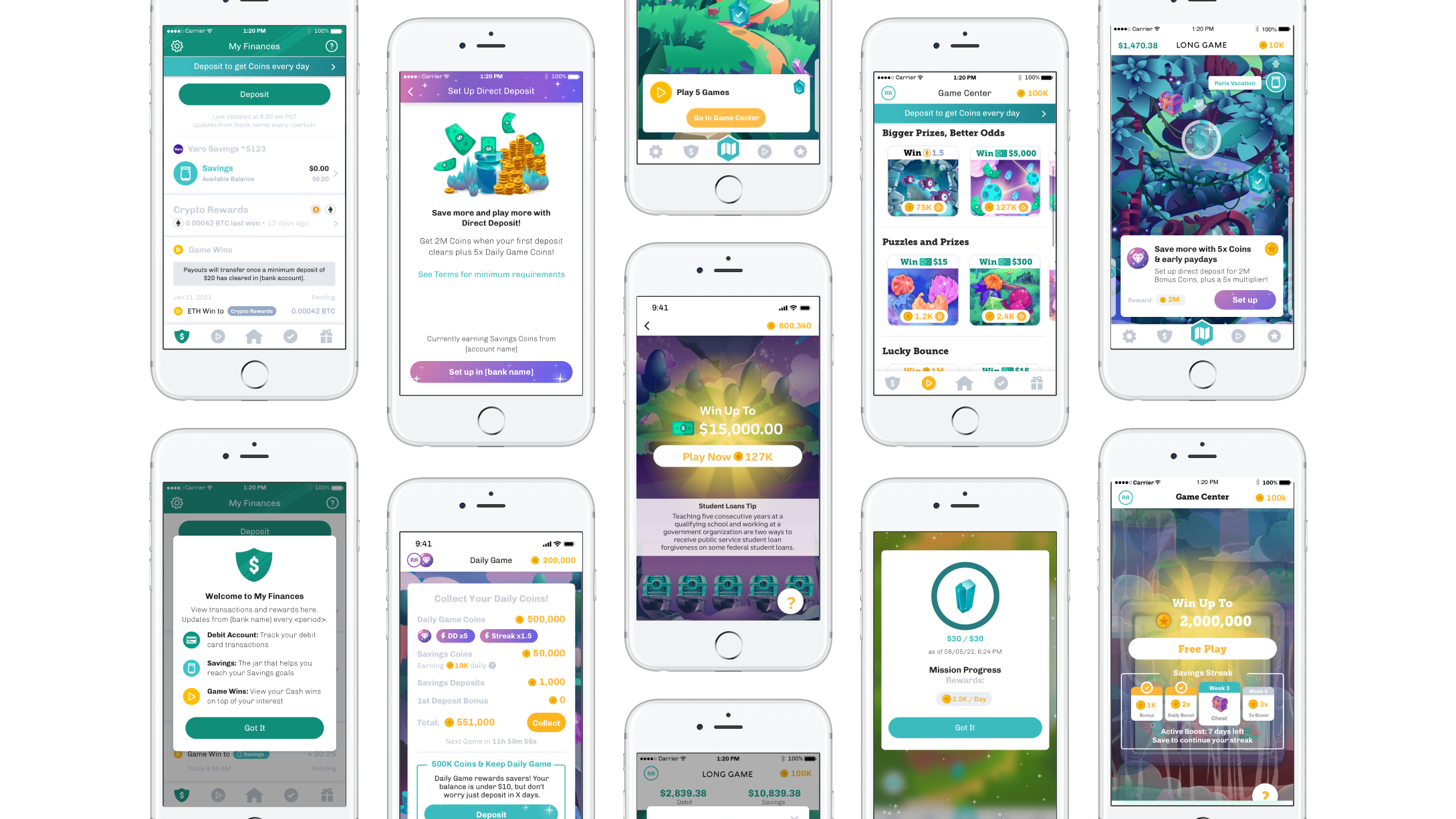
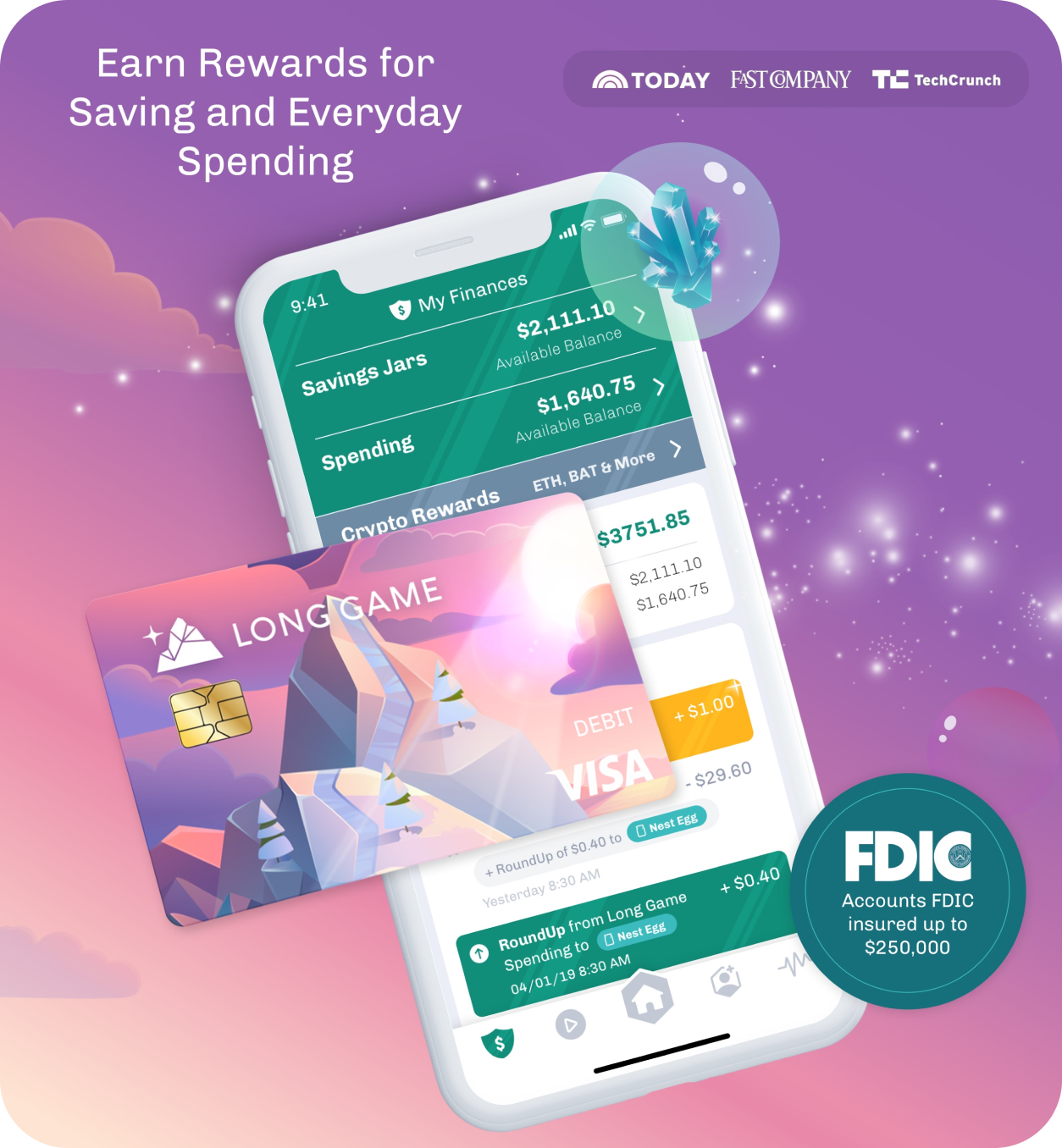
One key issue that came up was that our users wanted to use us as their primary bank, but couldn't because we only offered savings accounts. We decided to partner with nbkc bank to offer a checking account and debit card, turning Long Game into a full fledged neo-bank.
- Revenue increased through debit transactions
- Value add through more account rewards
This also helped a long-standing pain point potential users had with Long Game: access and trust. Users were more likely to trust a bank that they could easily access via a debit card, and partnering with a brick and mortar, FDIC insured bank also helped users feel more secure.
Refining the Core Loop
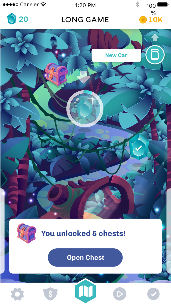
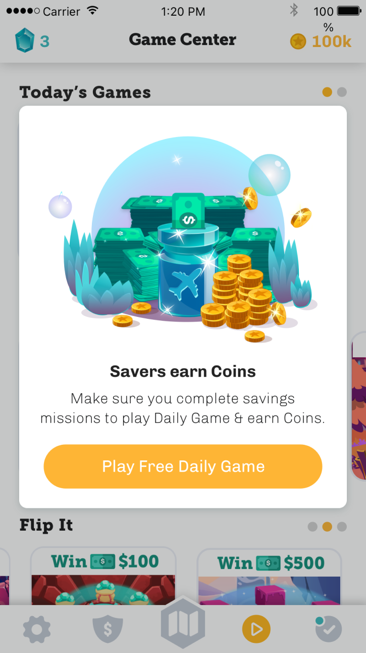
By 2019, the app was successful but had some issues with user engagement and retention. Some of the earlier experiments such as Brains had been confusing to users, and the games themselves were repetitive. We hired a game designer to help us refine the core loop of the app and address these issues.
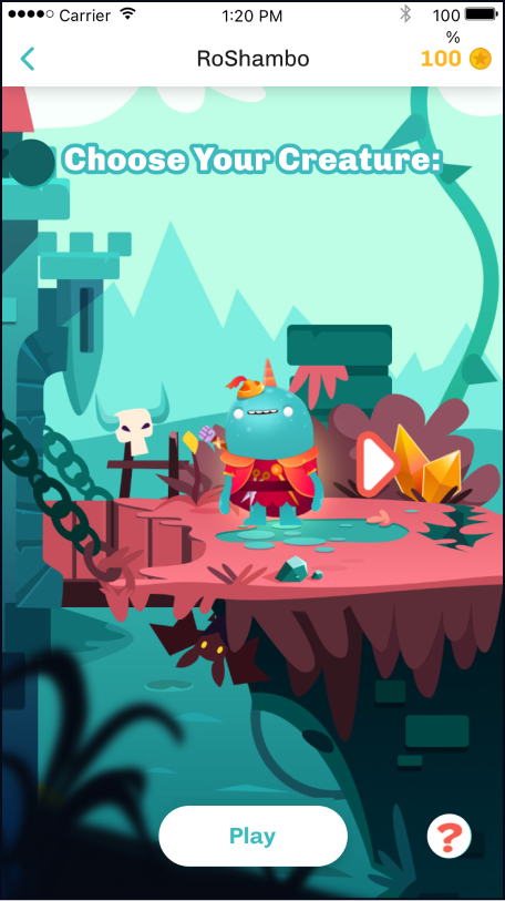
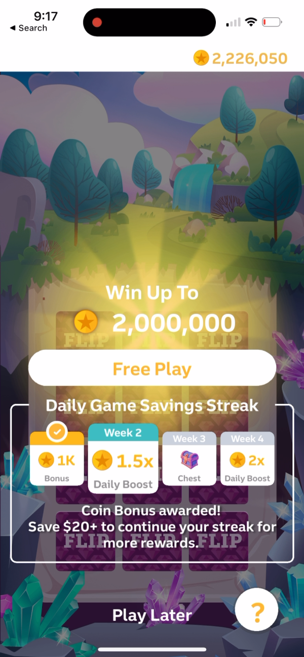
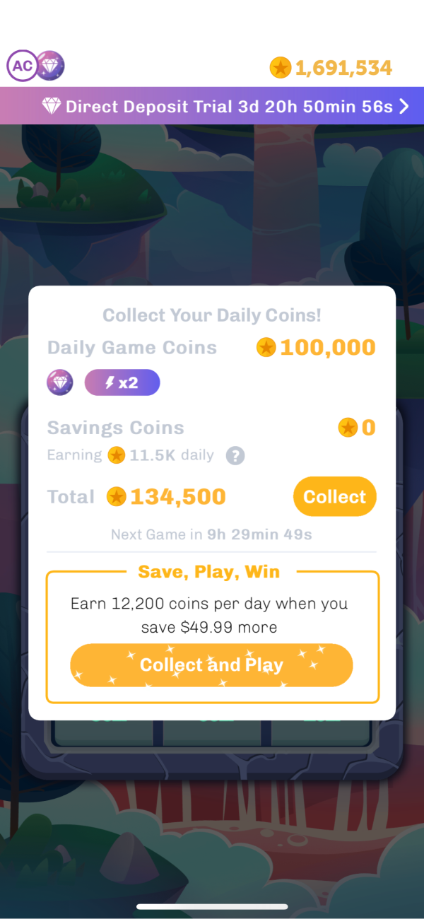
We started by removing several polarizing and failing features, such as creatures and Brains, and we created a “Daily Game” to improve engagement and retention:
- Play 1x per day for extra Coins
- Earn Streaks and Boosts
- Win mystery chests for engaging regularly
New Games
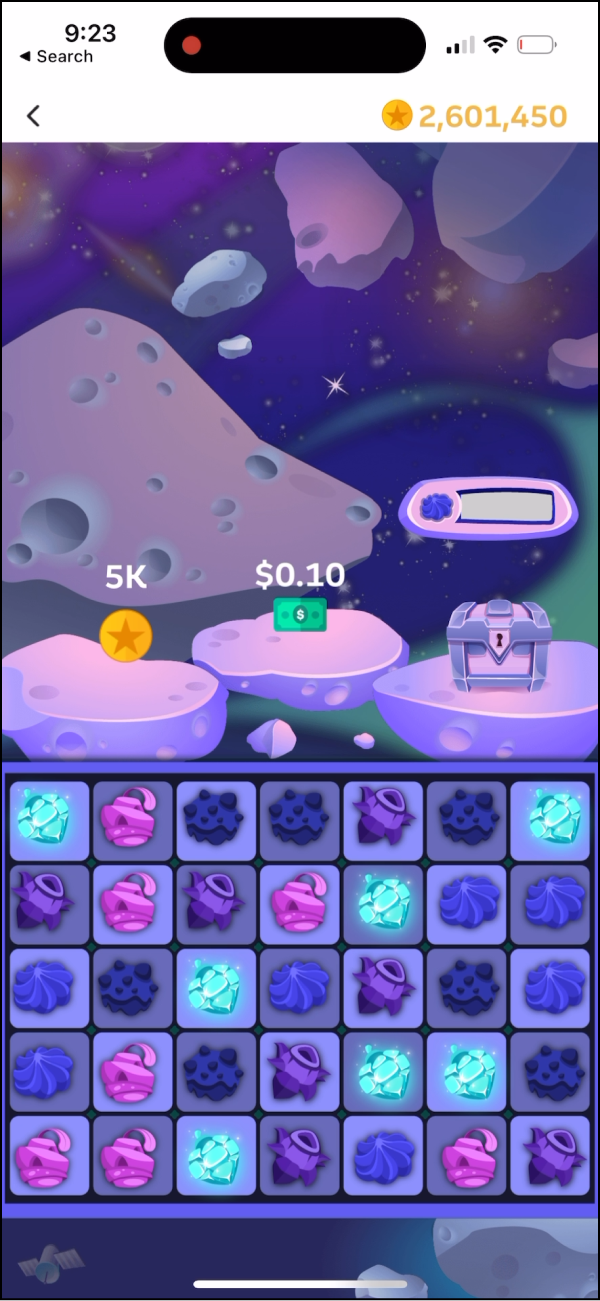
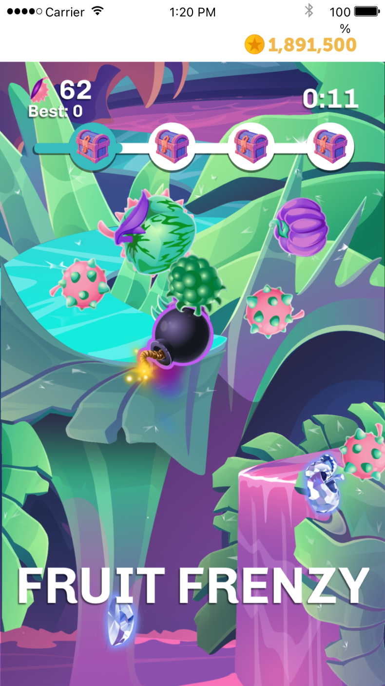
One of the key issues we faced was that our games had to be "games of chance" to comply with sweepstakes laws. These constraints led to game experiences that felt boring an repetitive, without a sense of accomplishment.
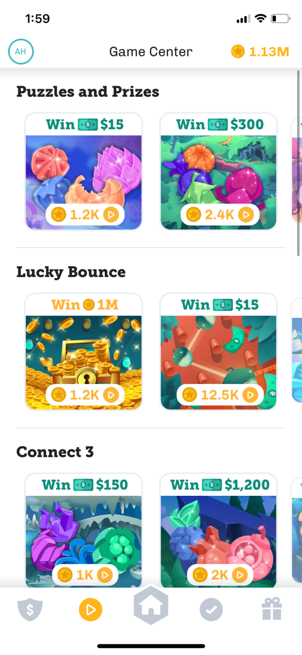
In collaboration with our Game Designer, I led the creative direction of a variety of new games to address this. We started by launching over 40 games with unique sweepstakes options for Coin and Cash wins. Then, we began roadmapping a "metagame" where users could progress outside of the sweepstakes challenges.
The Metagame
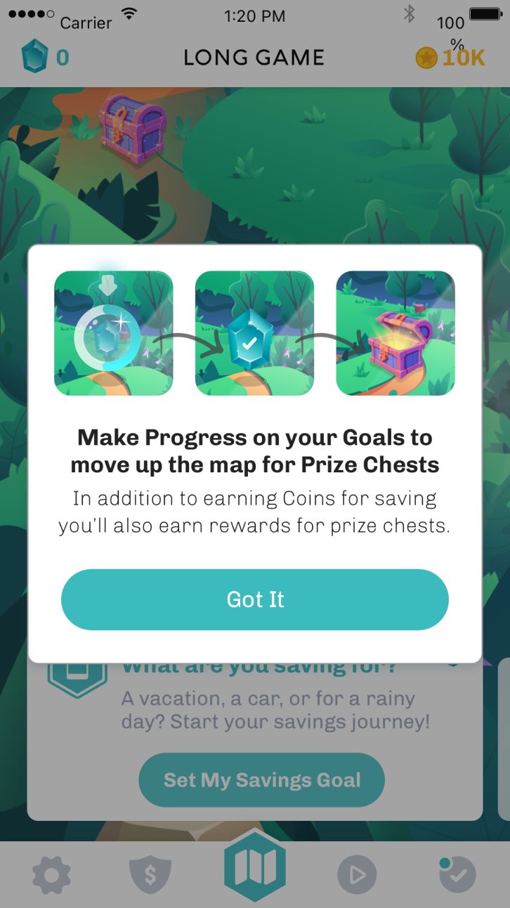
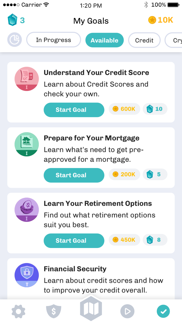
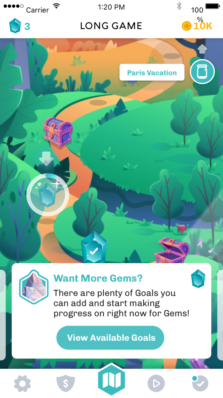
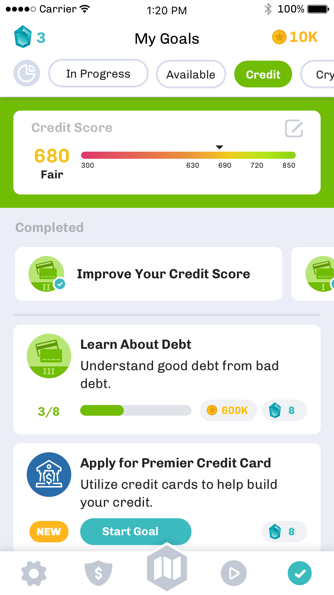
While users could not progress and gain advantages in the games themselves, we wanted to give them a sense of progression and achievement. We started focusing on a "metagame" based on the financial roadmap we had started with the Journey Map.
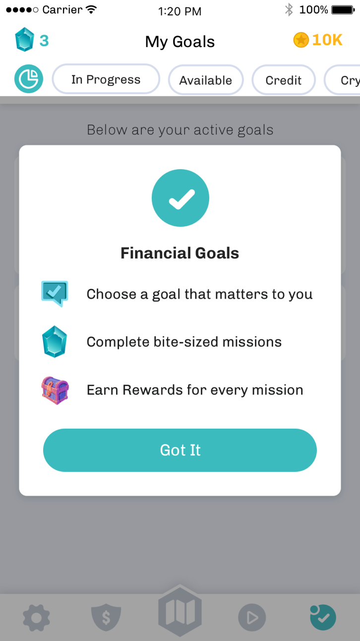
Users would be able to gain more levels and rewards by achieving their savings goals. These rewards were non-monetary, but provided other benefits like unlockable avatars and collectibles. Long term, we planned to offer non-chance based games where these items could provide direct value to the player in-game.
One Goal: Achieve Profitability
Pivot 1: Tiered Monetization
With the global pandemic, we were forced to focus on profitability as our runway was running out and funding was becoming harder to secure. We realized that our current debit transactions were not getting us to profitability, so we needed to find other solutions to maintain runway.
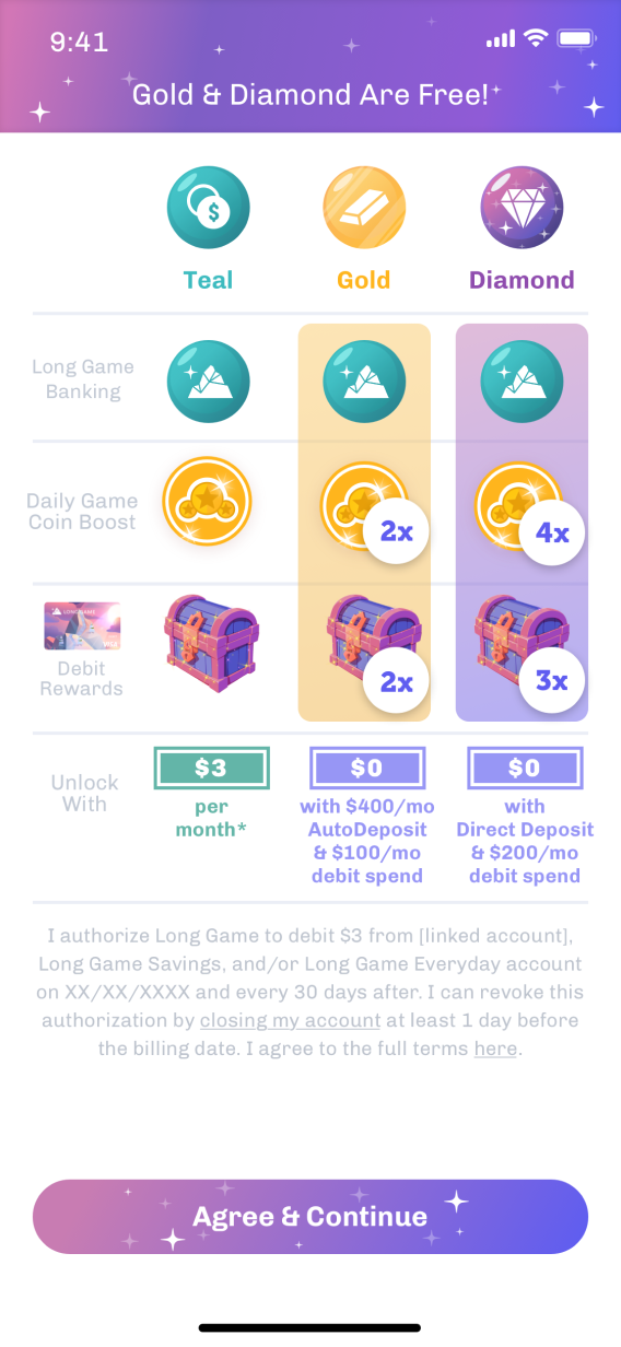
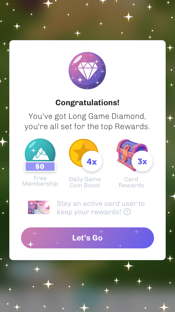
We experimented with a tiered approach to offer boosts for Direct Deposit options, or a pay-to-use bottom tier.
The concept was well received in user tests, but it wasn’t the right fit for user retention in the end.
Pivot 2: B2B2C
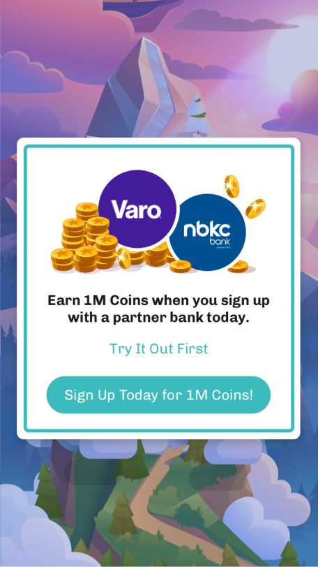
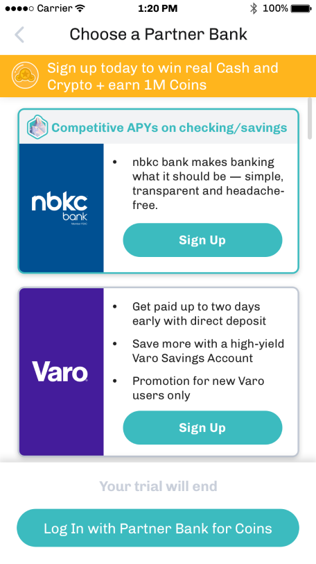
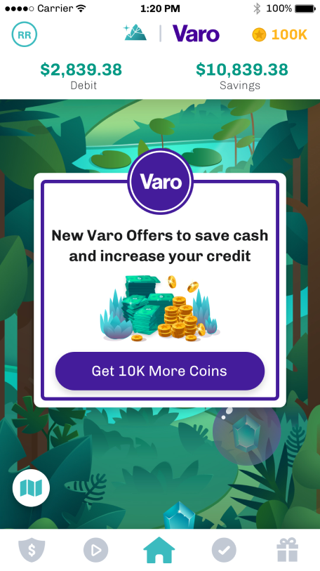
We shifted focus to partner directly with traditional banks, enabling users to register with Long Game via their existing bank accounts.
- Short term: Affiliate Offers
- Long term: offer Long Game as a user acquisition and retention service for other banks
We launched Long Game Rewards in December 2020 and partnered with 12 banks for our initial offering. However, one of our partner's decided that they wanted a more exclusive arrangement: Truist Bank.
Acquisition by Truist Bank
Truist Acquisition
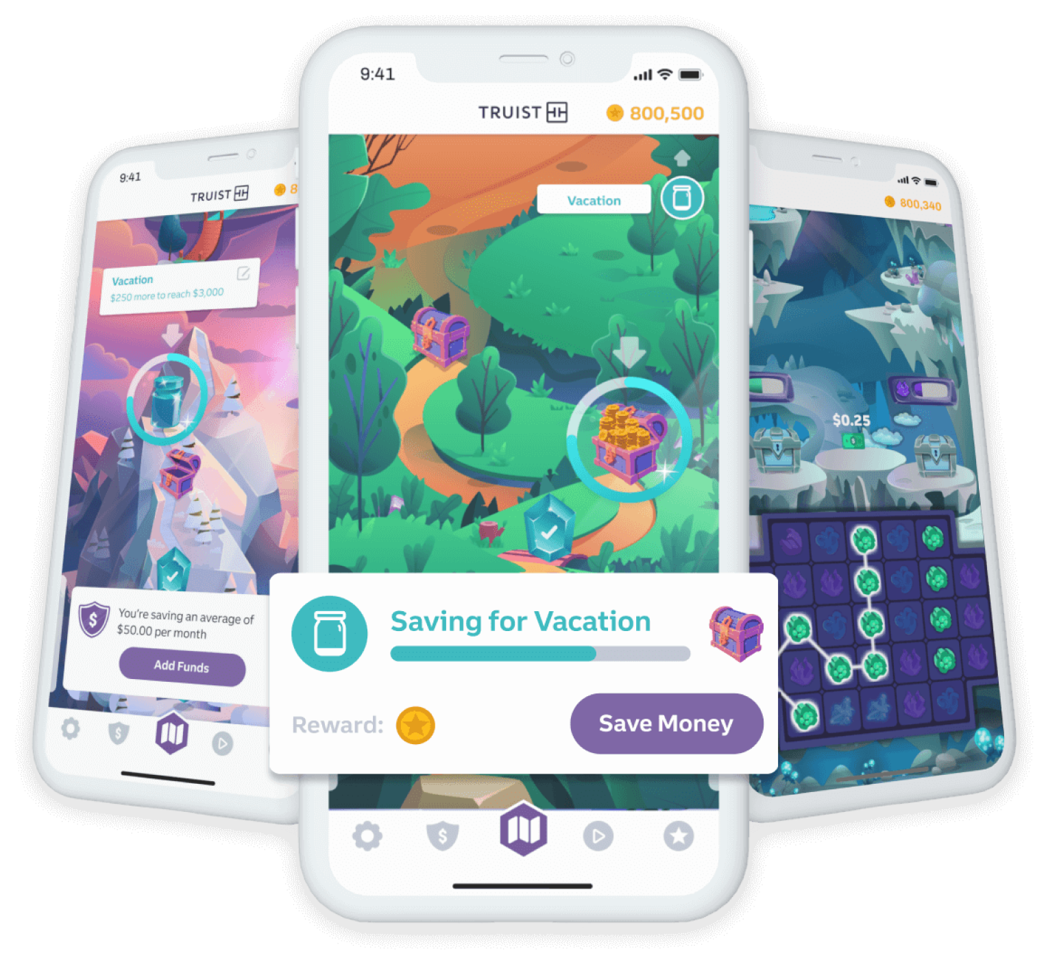
Truist was looking to innovate and compete with other existing banks more aggressively. They loved the concept behind Long Game, and were impressed by our user satisfaction and retention.
- Officially acquired by Truist bank in April 2022
- Became the “startup within a bank” innovation team
- Re-worked the app to integrate with Truist bank and adhere to regulations
The Outcome
Being the sole product designer for Long Game was an exciting and, at times, indimidating experience. When I began, I was a newly minted design graduate with a lot I grew in my design skill set as the company grew over time, and I ended up wearing many hats and filling many roles. I played the part of not just UI/UX designer, but also graphic and branding design director, product designer, game designer, and UX researcher, among many other small parts.
I learned a lot in this time, and went through a rollercoaster of highs and lows. We made mistakes and had to adapt and learn on the fly, and I went through a huge amount of self-education on game mechanics, behavioral economics, and systems design. After joining Truist, I focused on management and higher level direction, and learned what it was like to work at a larger company (quite a culture shock after 5 years on a 10-person team!). In the end, I was thrilled to have this years-long project recognized through awards and acquisition. I cannot thank the Long Game team enough for their collaboration and support throughout the years.